P/L Curves
How to use the P/L chart in projectoption.
P/L Curves
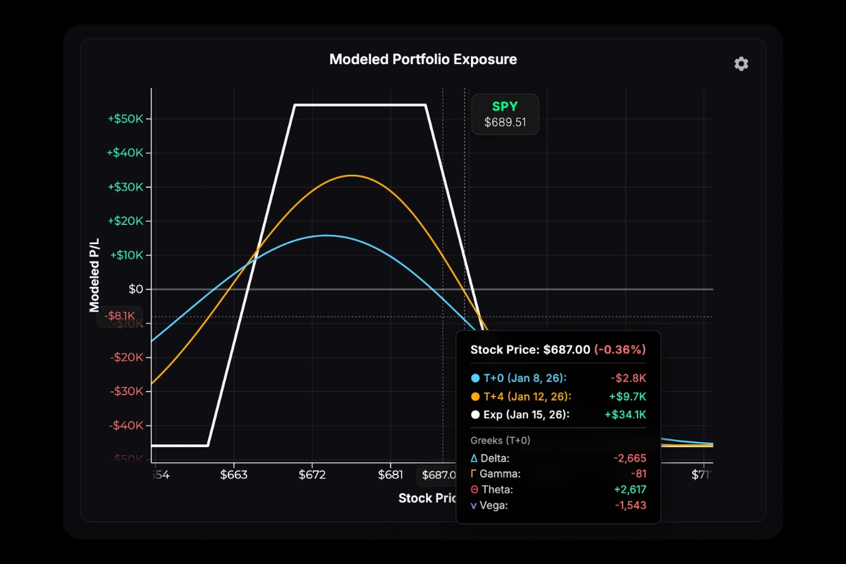
The chart shows theoretical profit/loss across stock prices at three time points:
- T+0 (cyan) — Current modeled exposure as of the current moment.
- T+50% (orange) — Halfway to your longest-dated position’s expiration.
- Expiration (white) — P/L at expiration. Intrinsic value only.
T+ notation means “today plus N days.” T+0 is today, T+15 is 15 days from now. The T+50% line represents 50% of the time elapsed to your longest-dated position—if your furthest expiration is 30 DTE, T+50% shows the position’s modeled P/L curve +15 days in the future.
Expiration Anchoring
When you have multiple expirations, the Exp dropdown (next to the chart) controls which expiration date the curves reference:
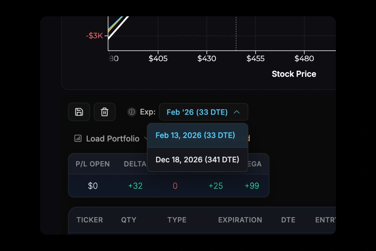
- Expiration line — Shows P/L at the selected anchor date.
- T+50% line — Shows P/L at 50% of the time to the anchor date.
For example, if you have options expiring in 30, 90, and 365 days, you can anchor to any of these. Anchoring to 365 DTE plots T+365 and T+182 lines. Anchoring to 30 DTE plots T+30 and T+15 lines.
By default, the nearest expiration is selected—this provides the most accurate view of your immediate risk. You can change the anchor to see how your position evolves over longer time horizons, keeping in mind the limitations noted below.
Hover over the info icon (ⓘ) next to the dropdown for a quick reminder of how anchoring affects your curves.
Multi-Expiration Portfolios
When your portfolio has options with different expirations, each T+ line shows only the positions that still exist at that point in time. A position appears on T+ lines before its expiration and is excluded from T+ lines after it expires. However, the premium you paid or collected for expired positions always remains in your cost basis.
Example: Suppose you have a 100 DTE long call (paid $2,000) and a 30 DTE short call (collected $500). Your net cost is $1,500. If you display T+0, T+25, T+50, and T+100 lines:
- T+0 and T+25 — Both positions are plotted (the short call hasn’t expired yet)
- T+50 and T+100 — Only the long call is plotted (the short call expired at T+30)
Even though the short call disappears from the T+50 and T+100 curves, the $500 credit you collected is still factored into your cost basis—your breakeven and P/L calculations reflect that premium.
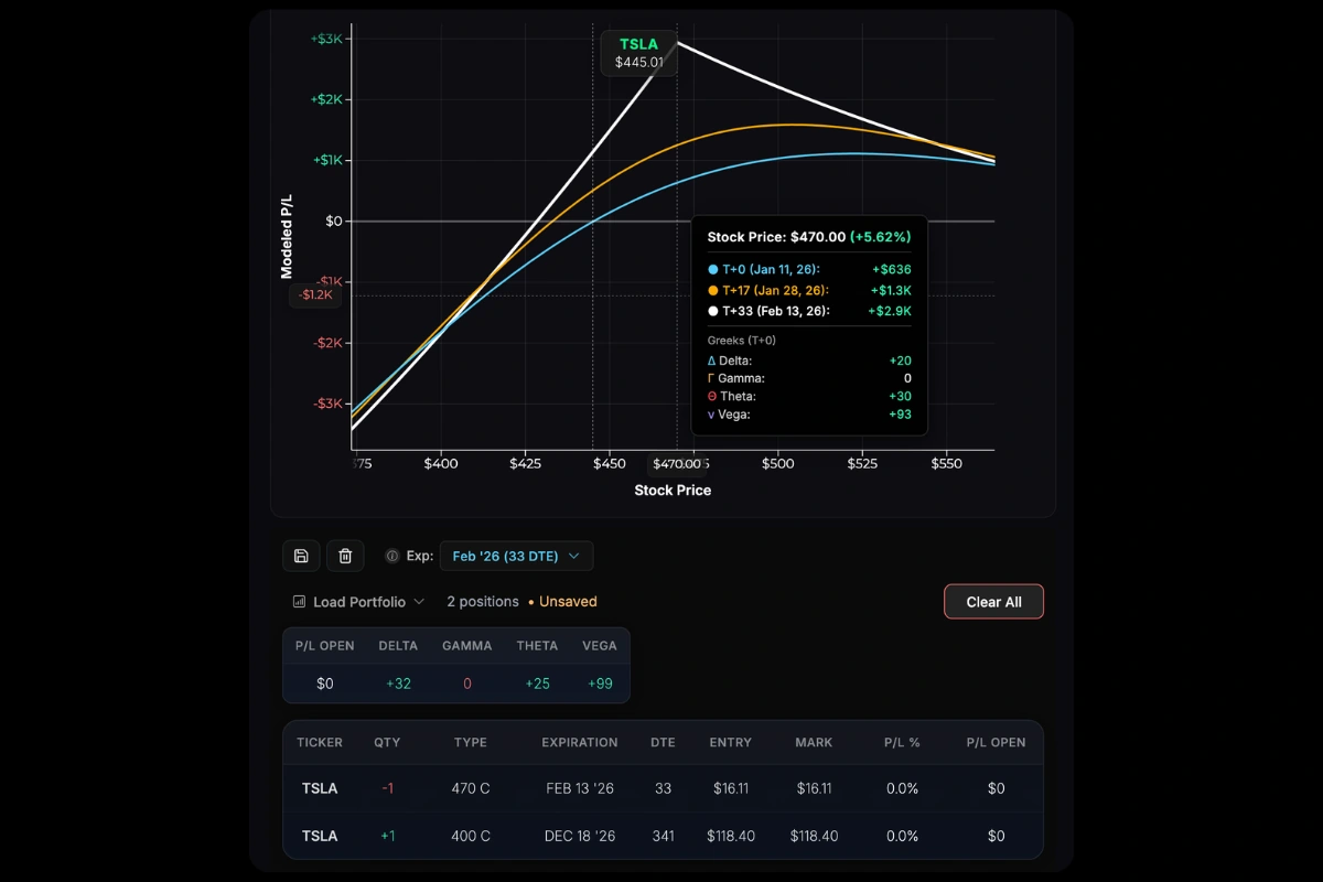
Near-Term Anchor Example: With a 341 DTE long call and 33 DTE short call, anchoring to the near-term expiration (33 DTE) shows all curves reflecting both positions. P/L peaks at the short call strike ($470) at its 33-day expiration, while the overall position P/L tapers as stock price increases.
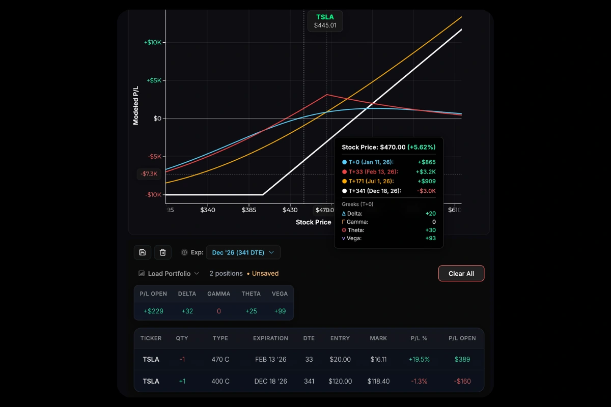
Long-Term Anchor Example: The same positions anchored to 341 DTE, with a custom T+33 line added. The T+0 and T+33 lines reflect risk from both positions, while T+170 and T+341 show only the long call’s exposure (with the short call’s credit already collected).
Limitations of Long-Term Projections
T+ lines beyond a position’s expiration assume the position expires worthless/out-of-the-money. In reality, this is a simplification—you don’t know what the stock price will be at the near-term expiration, what P/L you’ll actually realize, or whether you’ll roll or adjust the position before expiration.
For this reason, we recommend anchoring to the nearest-term expiration in your portfolio for the most accurate representation of your current risk. Longer-term T+ curves can still give you a sense of your exposure after near-term positions expire, but they’re best viewed as a rough outlook rather than a precise projection.
Interactions
| Action | Effect |
|---|---|
| Scroll | Zoom in/out |
| Drag | Pan left/right |
| Double-click | Reset view |
| Hover | Show exact P/L at any price |
Adding T+ Lines
Beyond the three default curves, you can add custom T+ projections to see your position at any specific date.
See T+ Lines for details.

With Adjustment Mode
When modeling trades, the chart shows:
- Dashed lines — Your current (baseline) position
- Solid lines — Position after proposed adjustments
Hover over the chart to see the projected P/L difference at various stock prices and points in time if you were to execute your adjustments.

Was this page helpful?